Correcting Outlook DPI Scaling Issues
Update (May 28, 2023): Minor updates to code examples.
Outlook DPI scaling is one of the most common problems encountered when developing emails and supporting Outlook (alongside the 1px horizontal line issue). The severity of impact caused by DPI scaling depends on what you’re trying to accomplish with the email’s design/layout/structure, and how the email is coded.
At Litmus Live Boston and San Francisco this year, I gave a talk on correcting Outlook DPI scaling issues, while also looking at how it applies to Hybrid development, and touched on some other aspects it impacts that are common in email development today.
Before we dive into how to solve DPI scaling, let’s first understand why we see these issues with our emails in Outlook in the first place.
What is DPI scaling?
DPI scaling is actually an accessibility setting in Windows, found in the control panel where display and screen resolution settings are found. Typically the DPI has been set at 96 (or 100% zoom) by default. However, this has been changing as high resolution screens are set to a DPI of 120 (125% zoom) or even 144 (150% zoom) by default instead. Depending on the computer, there may even be more options than just 100%/125%/150%. As well, users can also set the DPI to a custom value if they so choose (“Set custom text size” option in the left panel).
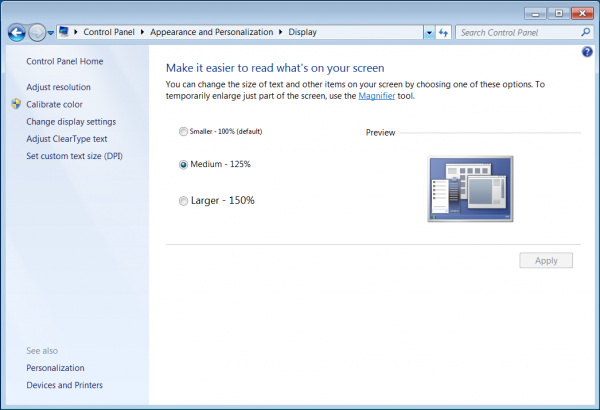
DPI (Zoom) Settings in Windows 7
When a DPI higher than 96 (100%) is used, all text and graphical elements are scaled up — kind of like when you zoom in on a webpage in your browser. It impacts everything from the task bar to application icons, and to how applications look themselves when in use. It’s a global setting across the computer, not a setting specific to only Outlook.
This scaling up is great for users, because it makes everything much easier to read. Sometimes changing the screen resolution to increase text size isn’t ideal, so the DPI setting can be changed instead.
However, this isn’t so great for us when we’re developing emails. Because Outlook 2007+ use Word as the rendering engine, it reads our code and changes only parts of it, while leaving other parts as-is. In the end, our emails don’t look so great, and could even look broken. This isn’t good for our subscribers and accessibility, and is why we should aim to make our emails look great at higher DPI settings too — especially if you know you have a high percentage of your subscribers opening in Outlook.
What Causes These Scaling Issues?
There are 2 main reasons why we see issues with our emails at 120 or higher DPI:
1. Width and height attributes in pixels remain as pixels
These are the HTML width (and height) attributes that we apply to our tables and table cells to build the structure of our emails. When these attributes are used with values that are pixels, they stay as pixels.
2. Other pixel values turn into points
These would be other pixel values like CSS font-size. When changed into points, they become scalable like percentages.
This combination of some values remaining as pixels (not scalable) and other values changing to points (scalable), creates the rendering issues that we see at higher DPI settings. This is why our text can look huge, while columns look squished.
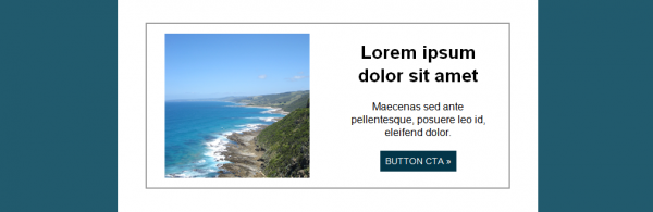
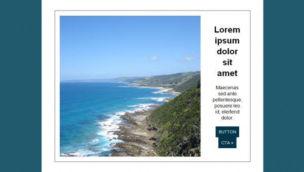
Below is a very simple two column example. We can see how when the DPI is increased, that our text is larger, image is larger, but the structure remains pretty much the same — giving that squished column look. You can imagine how a much more complex layout would have more severe rendering issues.
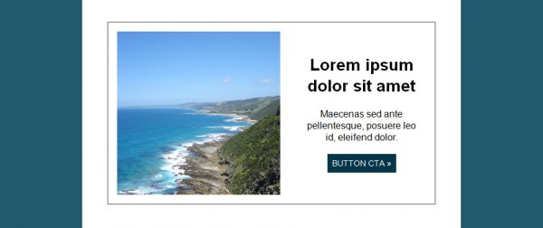
A two column layout at 96 DPI (100% zoom)
A two column layout at 120 DPI (125% zoom) – before fix
How Do We Fix It?
There are 3 parts required to correct the DPI scaling issues in Outlook.
Part 1. Add an XML Namespace
We need to add an XML namespace to our <html> tag. In a nutshell, namespaces define which elements belong to each namespace by using unique prefix names. For our purposes, the namespace we are using defines properties for use with Microsoft Office applications, like Outlook.
<html lang="en" dir="ltr" xmlns:o="urn:schemas-microsoft-com:office:office">
This is the first step in getting our images to render correctly at a higher DPI, and is needed so that Outlook can understand the next piece we’re going to add.
Part 2. Correct DPI for Images (PPI)
Next, we need to correct the DPI for images. This piece of Microsoft Office code goes right before the closing </head> tag, and allows us to force the DPI setting that we want.
<!--[if mso]>
<noscript>
  <xml>
    <o:OfficeDocumentSettings>
      <o:PixelsPerInch>96</o:PixelsPerInch>
    </o:OfficeDocumentSettings>
  </xml>
</noscript>
<![endif]-->
You’ll notice how the O prefix is also used here. This essentially maps or connects this code with the Microsoft Office namespace from Part 1. Our images won’t scale as we want them to without this, and this piece of code also won’t work without the namespace on the <html> tag. Part 1 & 2 are essentially a pair that work together to fix scaling issues with our images.
The key here in this code is the PixelsPerInch property, or PPI, which is where we set the DPI to what we want. That would be 96!
Part 3. Use CSS Instead of HTML Attributes
Our third piece of the puzzle is CSS. Remember how I mentioned above that other pixel values turn into points? Well, that would also be CSS width and height! Our HTML width and height attributes need to become CSS width and height instead. Note that this is not needed for percentages, as they’re already scalable.
<!-- Option 1: -->
<table border="0" cellspacing="0" cellpadding="0" role="presentation" width="600" style="width: 600px;">

<!-- Option 2: -->
<table border="0" cellspacing="0" cellpadding="0" role="presentation" style="width: 600px;">
<!-- Option 1: -->
<td valign="top" align="left" width="300" style="width: 300px;">

<!-- Option 2: -->
<td valign="top" align="left" style="width: 300px;">
There are 2 options for implementing this: you can add the CSS in addition to the HTML attributes that you’re using, OR you can replace the HTML attributes with the CSS equivalents. If you’re including both, make sure to update both if the values are changed.
If you use cellspacing and cellpadding, you’ll need to have a CSS solution added as well. In this case it’s mso-cellspacing and mso-padding-alt. I do recommend in place of cellspacing and cellpadding to use CSS padding instead.
<table border="0" cellspacing="4" cellpadding="8" style="mso-cellspacing: 4px; mso-padding-alt: 8px 8px 8px 8px;" role="presentation">
For these two, they need to be added in addition to the HTML versions, as they are specifically for Microsoft Outlook (note the mso- prefix), not a replacement.
Correct Outlook DPI Scaling For Hybrid Emails
So, how does this play into Hybrid emails?!
Hybrid is a method of developing responsive emails without the reliance on media queries. Traditionally, emails are developed using aligned tables, and media queries to override those desktop styles and stack the content into a single column for mobile.
Instead, Hybrid uses <div> with CSS display: inline-block;, width: 100%; and max-width for multi-column layouts, which will naturally stack one below the other when they no longer fit side by side. Media queries can still be used as a layer of progressive enhancement.
<td align="center" style="font-size: 0; padding: 15px;">
    <div style="display: inline-block; width: 100%; max-width: 300px; vertical-align: middle;">
        <table border="0" cellspacing="0" cellpadding="0" role="presentation" width="100%">
            <!-- Left Column -->
        </table>
    </div>
    <div style="display: inline-block; width: 100%; max-width: 300px; vertical-align: middle;">
        <table border="0" cellspacing="0" cellpadding="0" role="presentation" width="100%">
            <!-- Right Column -->
        </table>
    </div>
</td>
Because Outlook doesn’t support CSS max-width, the columns are wrapped in table-based code only read by Outlook by using Microsoft Office conditional comments.
<td align="center" style="font-size: 0; padding: 15px;">
    <!--[if mso]>
    <table border="0" cellspacing="0" cellpadding="0" role="presentation" width="100%">
    <tr>
    <td valign="middle" align="left" width="300">
    <![endif]-->
    <div style="display: inline-block; width: 100%; max-width: 300px; vertical-align: middle;">
        <table border="0" cellspacing="0" cellpadding="0" role="presentation" width="100%">
            <!-- Left Column -->
        </table>
    </div>
    <!--[if mso]>
    </td><td valign="middle" align="left" width="300">
    <![endif]-->
    <div style="display: inline-block; width: 100%; max-width: 300px; vertical-align: middle;">
        <table border="0" cellspacing="0" cellpadding="0" role="presentation" width="100%">
            <!-- Right Column -->
        </table>
    </div>
    <!--[if mso]>
    </td></tr></table>
    <![endif]-->
</td>
In regards to correcting Outlook DPI scaling, it’s actually quite simple but not really that clear at first. Thankfully, Hybrid emails are already more flexible and a bit more giving than other techniques for developing emails. That being said, the fix lies in… the MSO conditional comments!
When I was developing email templates earlier this year, I really wanted to correct any rendering issues that I could in Outlook with a higher DPI… especially when it’s not possible to know if subscribers are using a higher DPI setting, but I could see that they’re using Outlook. So, there is a chance that they are, and I wanted to provide the best experience possible.
At the time, it wasn’t obvious to me that it has to do with the MSO conditional comments when you’re coding Hybrid. It should, as it is code ONLY for Outlook, and the DPI issue is also only with Outlook. I could not find it called out in any resource I found about DPI scaling, and I even remember thinking, “I’m using Hybrid development, so how does this apply to me?!”.
For Hybrid emails, nothing changes in terms of Part 1 and 2 above to correct image scaling. Any way you develop an email will need those additional pieces of code to correct that.
So all we need to do is add the CSS to our MSO conditional comments (and anywhere else you might have HTML width and height attributes).
<td align="center" style="font-size: 0; padding: 15px;">
    <!--[if mso]>
    <table border="0" cellspacing="0" cellpadding="0" role="presentation" width="100%">
    <tr>
    <td valign="middle" align="left" style="width: 300px;">
    <![endif]-->
    <div style="display: inline-block; width: 100%; max-width: 300px; vertical-align: middle;">
        <table border="0" cellspacing="0" cellpadding="0" role="presentation" width="100%">
            <!-- Left Column -->
        </table>
    </div>
    <!--[if mso]>
    </td><td valign="middle" align="left" style="width: 300px;">
    <![endif]-->
    <div style="display: inline-block; width: 100%; max-width: 300px; vertical-align: middle;">
        <table border="0" cellspacing="0" cellpadding="0" role="presentation" width="100%">
            <!-- Right Column -->
        </table>
    </div>
    <!--[if mso]>
    </td></tr></table>
    <![endif]-->
</td>
You could even, especially in this particular example, use percentages in the width attributes instead. However I have found, depending on how complex the structure is, that this can get complicated when you’re also working with CSS padding and more nesting. I prefer to match the value of the CSS width in the MSO conditional comments to the max-width it is wrapping, in pixels, so that it’s consistent, easy math, and easy to update later on if needed.
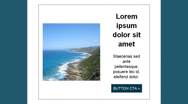
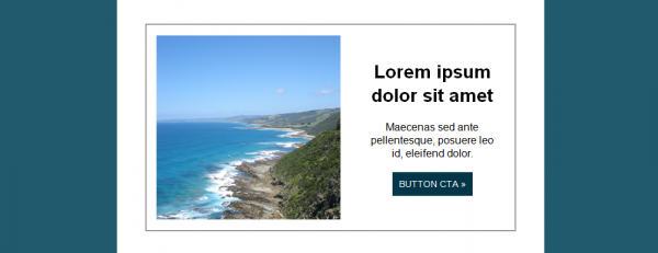
Going back to our two column example from before, we can see now with all of our corrections in place, how much better it looks! Yes it is still scaled up or zoomed in looking, but it is now all proportionate, which is what we want!
A two column layout, at 120 DPI (100% zoom) – before fix
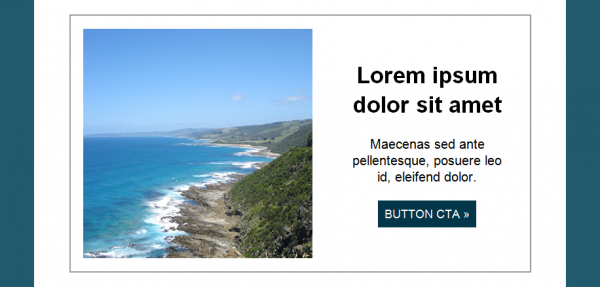
A two column layout, at 120 DPI (100% zoom) – after fix
Incorporating VML Background Images
VML has become more and more popular recently, especially for background images, since the Word rendering engine in newer versions of Outlook doesn’t support CSS background images or even the HTML background attribute.
When it comes to DPI scaling, VML is a little bit different though. When we implement VML for background images, we’re already using CSS width and height. So you would think that the image would scale. However, it actually does not! Those pixel values, even though it’s in CSS, does not get changed into points.
So we still need the code from Part 1 and 2 we added before, to correct our image scaling. But there is one piece of additional code that we need — and that’s another namespace specifically for VML. Without this, our VML background images won’t display at all.
If you’re using the VML code generated from Backgrounds.cm, then it will already have the VML namespace within that code. It’ll work in either place! However, if it’s not in the VML code directly that you’re using, then you can add it to the HTML tag.
<html lang="en" dir="ltr" xmlns:o="urn:schemas-microsoft-com:office:office" xmlns:v="urn:schemas-microsoft-com:vml">
This is often what you’ll see for correcting DPI scaling, but if you’re not using VML at all, then you don’t need to include the extra namespace for it.
In the example below, we can see how without the code from Parts 1 and 2 that the VML background does not scale, and we can see the background colour behind it. Even the text on top is not aligned properly! Once the code is added to correct image scaling, it then scales up proportionately with the rest of the email.
VML Background at 96 DPI
VML Background at 120 DPI – before fix
VML Background at 120 DPI – after fix
What About Retina Images?
With all of this scaling and images, you may be wondering about retina images. Retina images are images that are created at usually twice the size we want to display them at. So if we want to display an image at 300px by 300px, we would create it at 600px by 600px, but still use 300px in the code. This makes them look really crisp and clear on retina or high pixel density screens.
Retina inline images do work in Outlook, and even with DPI scaling! It’s actually a good idea to use retina images, not just for retina devices, but also for Outlook because scaled up retina images will look better than regular sized images.
Something also to consider is that retina images also work with VML background images!
If you’re using the code generated from Backgrounds.cm, then you’ll want to update the type attribute on the v:fill element to frame instead of tile.
<!--[if mso]>
<v:rect fill="true" stroke="false" style=“width:600px; height:318px;">
<v:fill type="frame" src="image2x.jpg" color="#fef8da" />
<v:textbox inset="0,0,0,0">
<![endif]-->
There is also a Litmus community post with a solution for getting VML background images to appear in Windows 10 Mail. The VML code in this method is a bit different, but retina images also work with it as well.
A Final Note on Outlook 2007
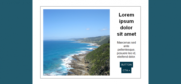
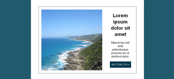
As James White found out (link below!), unfortunately Outlook 2007 doesn’t treat DPI the same as newer versions when changing the PixelsPerInch value in the code to correct image scaling (Part 2 of our fixes). Let’s use the two column example from above to see how that looks.
DPI Setting at 96
When we have the DPI setting on the computer set to 96, and the PPI in the code set to 96, the image displays as normal. We expect this since the DPI and PPI are both the same.
96 DPI and 96 PPI
If we decrease the PPI in the code to 72, the image enlarges a lot and we can see that the copy is getting squished from scaling up, and the CTA button goes onto two lines.
96 DPI and 72 PPI
Then increasing the PPI in the code to 120, the image actually shrinks! In some cases it may not actually be so bad if you’re not relying on images lining up with specific design elements or other images. But if wanted the image to be flush with the edges, this would not be ideal.
96 DPI and 120 PPI
DPI Setting at 120
Changing the DPI setting on the computer to 120 and leaving the PPI in the code set to 120, we’re again seeing the image at its normal size because the values are the same.
120 DPI and 120 PPI
Decreasing the PPI in the code to 72, again the image enlarges a lot, even more so than with 96 DPI, and the copy is very squished.
120 DPI and 72 PPI
Increasing the PPI in the code up to 96, we can see that the image is rendering larger than normal, but not as bad as 72 PPI.
120 DPI and 96 PPI
So, can we fix this?
The unfortunate news is, there isn’t really anything we can do about this without causing issues for one scaling factor or the other. If we try to correct the rendering for Outlook 2007 at 120 DPI (by using 120 PPI in the code), it will cause rendering issues for those using 96 DPI (image shrinks). If we do the opposite and use 96 PII in the code (which we do in Part 2 of our fixes), then it causes rendering issues for those using 120 DPI (image enlarges) in Outlook 2007.
Though we can target Outlook by version (2007, 2010, etc), there isn’t a way to target Outlook by DPI, as it’s a computer setting.
Based on these results, sticking to 96 PPI is probably the best bet. If you’re going to change it, make sure to test in newer versions of Outlook and it would be best to target Outlook 2007 separately (I have not tried this myself, so test!). I also recommend avoid setting PPI in the code to 72, as that definitely produced the least desirable results!
Additional Resources
Thank you to James White and Michael Muscat for their posts on Outlook and DPI scaling. Be sure to check them out as well!